How To Read The Candlestick Chart For Stocks? – The Japanese Candlestick Chart Explained Easy And Simple
Being able to correctly represent the stock price either using a Japanese candlestick chart or a stock bar chart is an absolute must if we want to focus on technical analysis to trade and make money in the stock market.
In this article, we will be focusing on how to read the candlestick chart for stocks, comparing it to the stock bar chart, and explaining which are the advantages of doing so and how it will be helpful to our trading.
Of course, we first will explain the difference between the candlestick vs bar chart and show why using the first one is far better than using the latter.
Let us begin then!
Table of Contents
What is a bar chart in stock market?
Before learning about the Japanese candlestick chart, we will first define the most simple way to represent a stock, which is by using a stock bar chart.
A stock bar chart is the most easy and straightforward way of representing the price variations in a stock and any time unit we want.
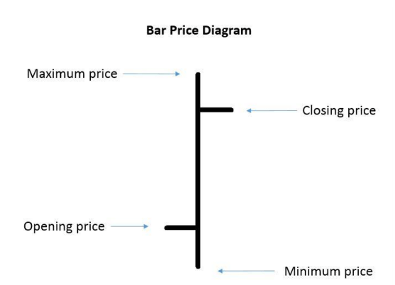
A stock bar chart will provide us with the four data we need to know how the price is evolving. In other words, a stock bar chart will tell us the opening price, the closing price, the maximum, and the minimum price of a time unit we choose.
How to read a stock bar chart explained
The best way to learn how to read a stock bar chart is by representing it with a visual example.
The stock bar chart model is quite simple, as you can see here. The price is displayed with a vertical line that represents the price of the stock. We also have two horizontal lines. The left one represents the opening price, while the one from the right represents the closing price.
The closing price will continuously be changing during the bar price formation until the time unit is completed. At that moment, the bar will keep its closing price static, and a new bar price will be opened.
Representing the bar chart in stock market
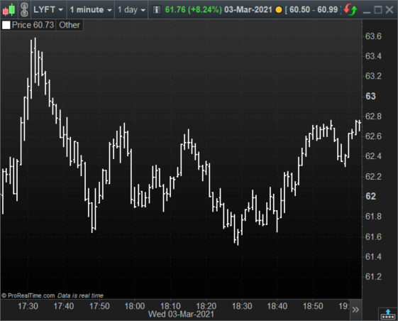
Now that we know how to read a stock bar chart, let us take a look at a real stock example.
As you can see in this stock bar chart, it is quite hard to follow the price direction if we focus on a bar-to-bar basis. It is also quite confusing to trade like this because we cannot see what the price attempted to do.
Using the Japanese candlestick chart, we will be able to read the direction of the price and the story behind every time unit.
What is the Japanese candlestick chart for stocks? – The candlestick chart explained
Like the stock bar chart, the Japanese candlestick chart represents the price, but it will provide us with much more information than the bar chart.
How to read the candlestick chart for stocks?
In essence, the Japanese candlestick chart will provide the same information as the bar chart plus a visual indicator of the price’s movement and its direction.
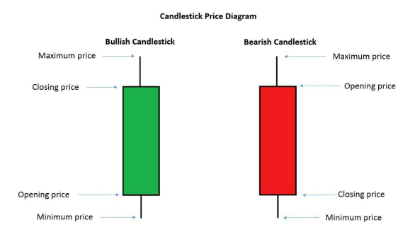
As you can see, the Japanese candlestick is a rectangular form known as the body with some outer lines called shadows. There are two types of Japanese candlestick, the bullish one and the bearish ones.
- The bullish Japanese candlestick has the opening price at the rectangle base, while the closing price is the upper part of the body.
- The bearish Japanese candlestick has the opening price at the top of the body, while the closing price is the base of the body.
It is much easier to find out the price trend by looking at a Japanese candlestick chart, as the representation tells us if the time unit was bullish or bearish and its behavior.
Representing the Japanese candlestick chart for stocks
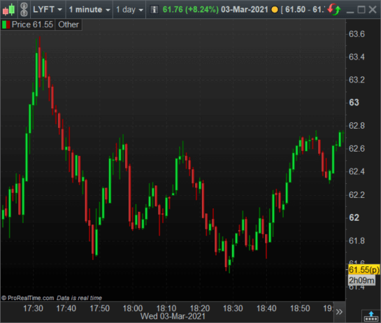
Now that we know how to read the candlestick chart for stocks let us look at a real example.
The previous Japanese candlestick chart is the same as the previous stock bar chart example. We can see at a glance the vast differences between the stock bar chart and the Japanese candlestick representation.
First of all, now it is relatively easy to tell where the trend is heading. And second, the closing prices are way more readable and visually friendly than the stock bar chart representation.
Many traders consider the Japanese candlestick chart the ultimate way to represent the price because of the easy and readable information it provides by taking a quick look.
The hidden advantage of the candlestick – The chart pattern candlestick and formations
Another reason why using the Japanese candlestick chart for stocks or any other asset is far superior to the stock bar chart is the price formations.
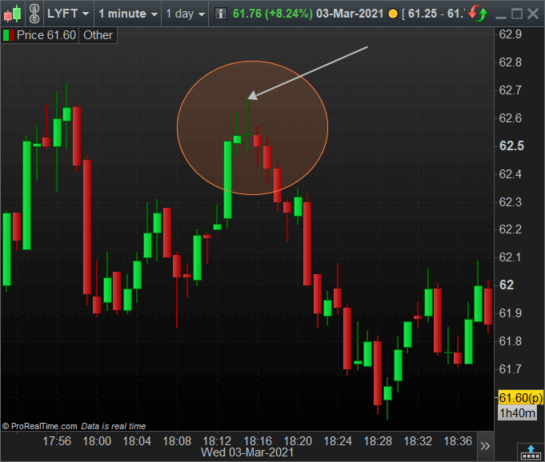
Many times, when we are trading, we are most likely to encounter a curious chart pattern candlestick formation that will foresee a movement in one direction or another. For example, let us take a look at this chart.
We have marked a chart pattern candlestick in the previous graph. This one is called Doji, and it typically forecasts a change of the current trend. As you can see, it actually works.
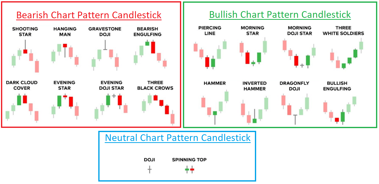
There are many chart pattern candlesticks that we can use to find opportunities to enter or exit a trade in the market. Take a look at the following image, which is a summary of the most common chart pattern candlesticks.
We can use the Japanese candlestick chart in technical analysis as another tool thanks to the chart pattern candlesticks.
Combining the Japanese candlestick chart in technical analysis
Now that we know how to read the candlestick chart for day trading or swing trading and how to use the chart pattern candlestick we have seen in the previous section, we have a powerful tool to help us most simple technical analysis.
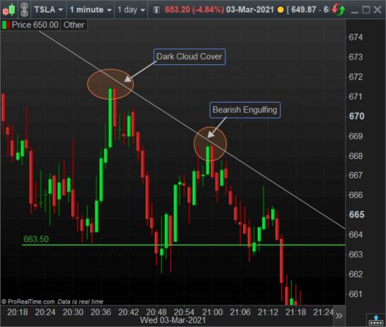
Let us take a look at the following descending triangle.
As you can see, we have combined the chart patterns candlestick with a bearish formation, using only price movement.
This is the power of the Japanese candlestick chart in technical analysis: we can trade without using any complicated technical analysis indicator.
Do you need a fast Stock Trading Journal that helps you make better decisions?In this short video, we will show you how to know in detail the results of your trading, how to get an estimate of the number of stocks to trade based on risk, and how to drastically reduce the time it takes to record your trades with this Journal |
Last words about price representation: Comparing Japanese candlestick vs bar chart
As we have seen, comparing the Japanese candlesticks vs bar chart, we have found out that the lastest is much more simple compared to the first one.
The enormous advantage of the Japanese candlestick is no other than the quantity of data that it can provide us by taking a quick look compared to the stock bar chart, that it will be more challenging to find out trends and directions in prices.
The Japanese candlestick patterns can also help us in our technical analysis because some formations will allow us to forecast the near future of the price trends.
If you need to choose between the Japanese candlestick vs bar chart, we highly recommend you stick to the first one, helping you trade better and make better decisions.
